Typography | Type Specimen Book
Centennial Type Specimen Book
Design Challenge
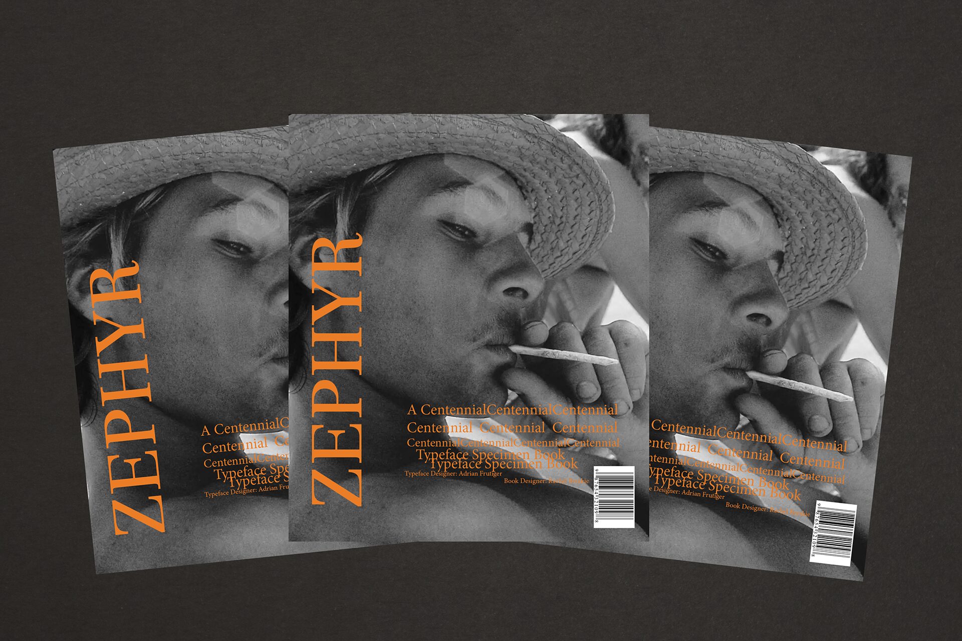
The challenge was to design a type specimen book for the Centennial typeface that not only showcased the versatility and elegance of the font but also honored its creator, Adrian Frutiger. The book required a balance between rich storytelling in the first chapter, which focused on Frutiger’s life and legacy, and visually compelling typography-driven layouts in the subsequent chapters, designed to highlight the typeface’s unique characteristics.
Objective
The objective was to create a cohesive and engaging type specimen book that celebrated the Centennial typeface and its creator, Adrian Frutiger. By blending historical context with dynamic type displays, the book aimed to educate and inspire readers while showcasing the typeface’s potential in diverse design applications.
Chapters
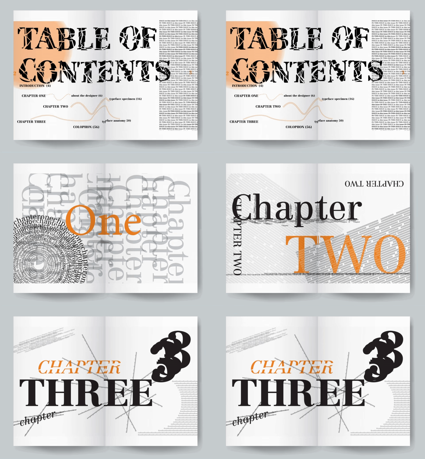
The opening chapter of the Centennial type specimen book is dedicated to Adrian Frutiger himself, providing readers with insight into the life and legacy of one of the most influential type designers in history. This section sets the tone for the book, celebrating Frutiger’s contributions to typography and offering context for the creation of the Centennial typeface.
The remaining chapters of the type specimen book boldly showcase the Centennial typeface through layouts inspired by the gritty, experimental style of *Raygun* magazine. Using the legendary Dogtown and the Z-Boys as the thematic focus, these pages explore the typeface’s versatility in capturing raw energy and rebellious spirit. Dynamic compositions and unconventional typographic treatments highlight how Centennial can adapt to bold storytelling, evoking the edge and attitude of skateboarding’s golden era.
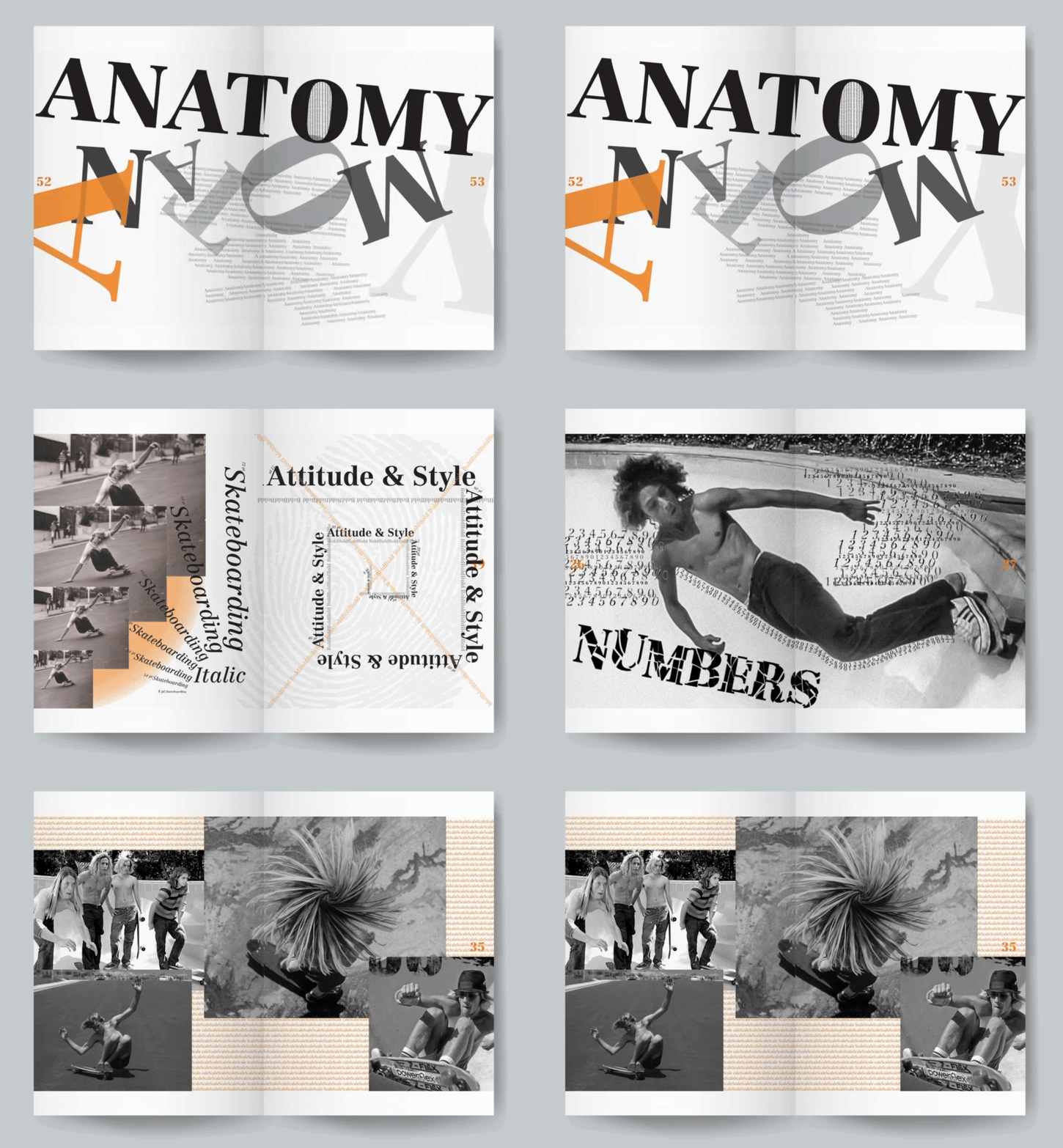

The remaining chapters of the type specimen book boldly showcase the Centennial typeface through layouts inspired by the gritty, experimental style of *Raygun* magazine. Using the legendary Dogtown and the Z-Boys as the thematic focus, these pages explore the typeface’s versatility in capturing raw energy and rebellious spirit. Dynamic compositions and unconventional typographic treatments highlight how Centennial can adapt to bold storytelling, evoking the edge and attitude of skateboarding’s golden era.
Results
The Centennial type specimen book successfully captured the essence of Adrian Frutiger’s work while incorporating the raw, dynamic energy of the grunge and Z-Boys movements. The final design effectively bridged traditional typographic elegance with a bold, unconventional aesthetic, engaging readers and highlighting the typeface’s versatility.
